Spacefold
Spacefold is an in-house project at Hyperstonk.
Simply put, we are creating a platform to facilitate digital product design, creation, and maintenance (web and mobile applications).
To make this happen, we used all the methods and resources we had at our disposal.
This case study condenses the application of all our knowledge without client constraints.
Brand audit, naming, strategy, positioning, brand platform, visual identity, logo design, 2D/3D illustration, brand guidelines, website, and digital product design.
Everything is there!
PS This case study describes a project's embryonic phase to its concrete realization. It is complete and reveals the secret structure of well-done branding.
Before satisfying your curiosity and avoiding the frustration of missing out on our secrets, you should prepare yourself a little snack for the journey ahead of us.
Audit
Strategy
Naming
Positioning
Brand platform
Identity
Brand guidelines
Website
The launch of an ambitious project.
First, a little background:
Remember when you had to quit an app because it was buggy?
Or the last time you left a website that wasn't working correctly?
It happens to all of us daily, and unfortunately, it's becoming increasingly frequent.
It's sad, but today, the digital products we create are full of bugs and inconsistencies. These digital products, which aim to improve our lives, are often trapped by their growth.
Maintaining them over the long term is extremely expensive.
Adding evolutions to them is often prohibitively expensive.
With every passing second, product designers are tearing their hair out, and developers are crying under their desks.
They ask themselves a lot of particular questions, like:
“How do we reduce the technical debt of our product?”
“How do we reduce the gap between our Figma mockups and the production dev environment?”
“How do we measure and visualize the impact of a single change in our designs on the entire product?”
We want to help them.
And to do it right, we need to state things clearly. Because at this project stage, we don't even have a name yet, just an idea and a problem to solve.
How do you launch a project properly?
The solution: branding.
In France, people think branding is mostly about having a logo and pretty colors. The thing is, it's much more than that. Branding is, above all, concrete business tools and methods.
Even before creating Spacefold's visual identity, we go through many strategic steps that allow us to move forward on the entire project.
First, the brand audit.
It allows us to take a good look at the situation. From the business model to the project's long-term vision, we review absolutely everything.
The objective is to pinpoint what we might have forgotten and to prioritize the subjects to be dealt with to bring the project to a successful conclusion.
Brand strategy and its purpose.
Well, great, we know where we're going.
With the audit, we know what we are missing in the overall project. We made an extensive prioritized list of the subjects to deal with, both for the brand and the construction of the digital platform itself.
We'll skip the details on the creation of the platform. All you need to know is that we create it parallel with the branding steps since we know where we are going.
Okay, let's continue with the branding part.
Now we're getting down to business. We apply all our methods related to branding.
Purpose, mission, vision, core values, trend study, differentiation, onliness statement, ecosystem definition, loyalty system, archenemy, blue ocean, differentiating touch points, slogan...
We're doing the whole thing.
With all these methods, we know exactly where we are going for the next 10 years.
We know how to help the world without betraying our values.
We know how to communicate “who we are, ”“what we do,” and “how we do it” in a powerful way.
We've created the ultimate compass for navigating through the fog with our eyes closed and hands tied behind our backs.
Next step: positioning.
The proper positioning to stand out.
We have defined the soul of our brand.
We precisely know what we are and what we want.
Now we want to know how to position ourselves in our market.
We made a list of our competitors.
We found 10 serious ones.
We dissect their presence in all types of media.
We put all our observations in a big data table.
We make perceptual maps, and we position the competition on them.
It's a quick summary, but that's it.
We visualize our big playground (aka market) and see where the school's good-looking pricks are positioned.
Our goal is to find the spot that 100% fits our soul and brings us the best business opportunities.
We find the right place and position ourselves, facing them, in the best spot.
Then, synthesis and definition of :
Our USP (Unique Selling Proposition).
Our positioning Statement.
We have all that is necessary to attack our market.
Before creating our visual identity, we have one more thing to do: our brand platform.
Brand Platform, or Spacefold's bible.
When playing the branding game, we try a lot of magic tricks based on methods.
Now it's time to synthesize and make this magic even more intelligible. We stop believing ourselves to be magicians... we do much worse.
Nothing can stop us; we play God and write our bible.
In the brand platform, we put the results of all the previous steps together.
The result to be achieved:
To have a document that clearly synthesizes everything that Spacefold is.
To make the result of all the previous steps intelligible to everyone.
To allow us to dig even more profound into this synthesis by writing the brand's manifesto.
Two or three wand strokes and a few incantations later, our document is finished.
We have everything we need to create the identity that suits Spacefold's character:
A brand strategy that's hot and scalable.
A clear, crisp, and precise market positioning.
A document that sums it all up and makes it even more specific.
Eventually, all these documents will be helpful in all internal teams. They are valid for all of Spacefold's divisions.
For the marketing team to better attract prospects, for the sales team to convert them, for the HR team to better recruit, etc.
And on top of that, we already have an idea of the direction that will take :
our visual identity
our digital platform
our global copywriting
our website
our marketing
our sales system
our commercial offers
...
In other words, everything is clear. We are ahead of the game by clearing the fog from the start.


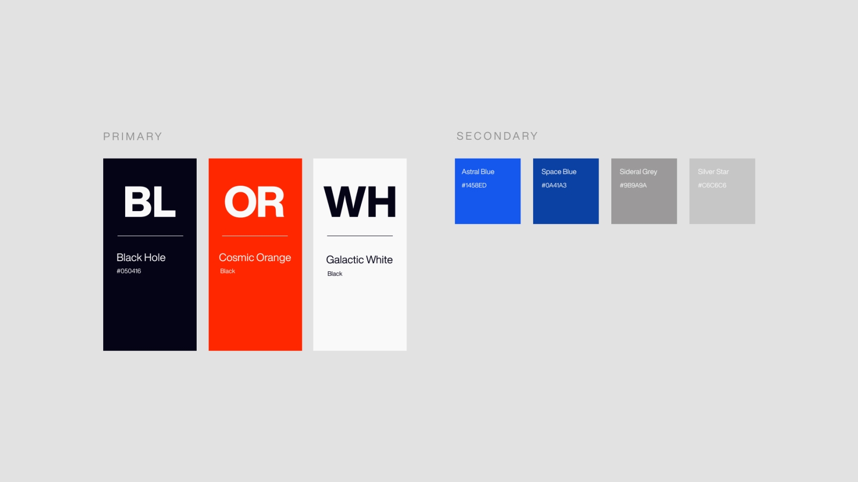
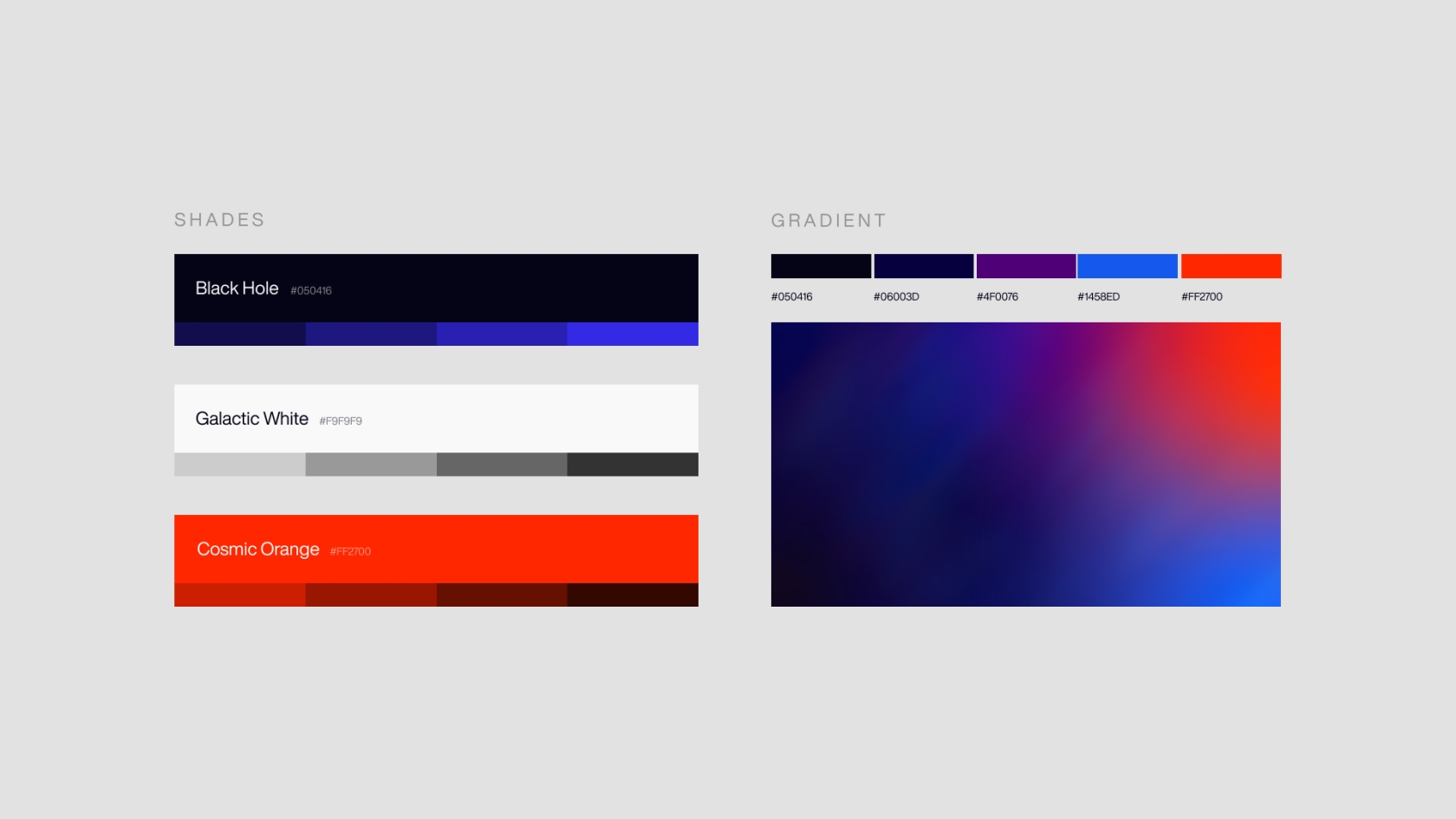
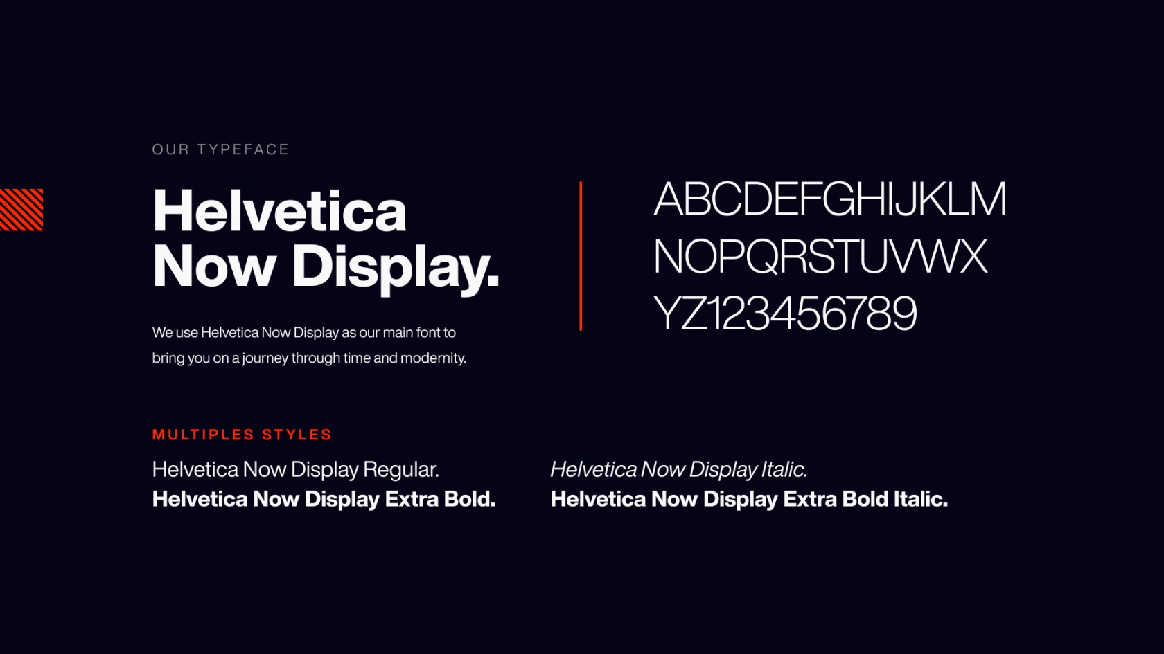
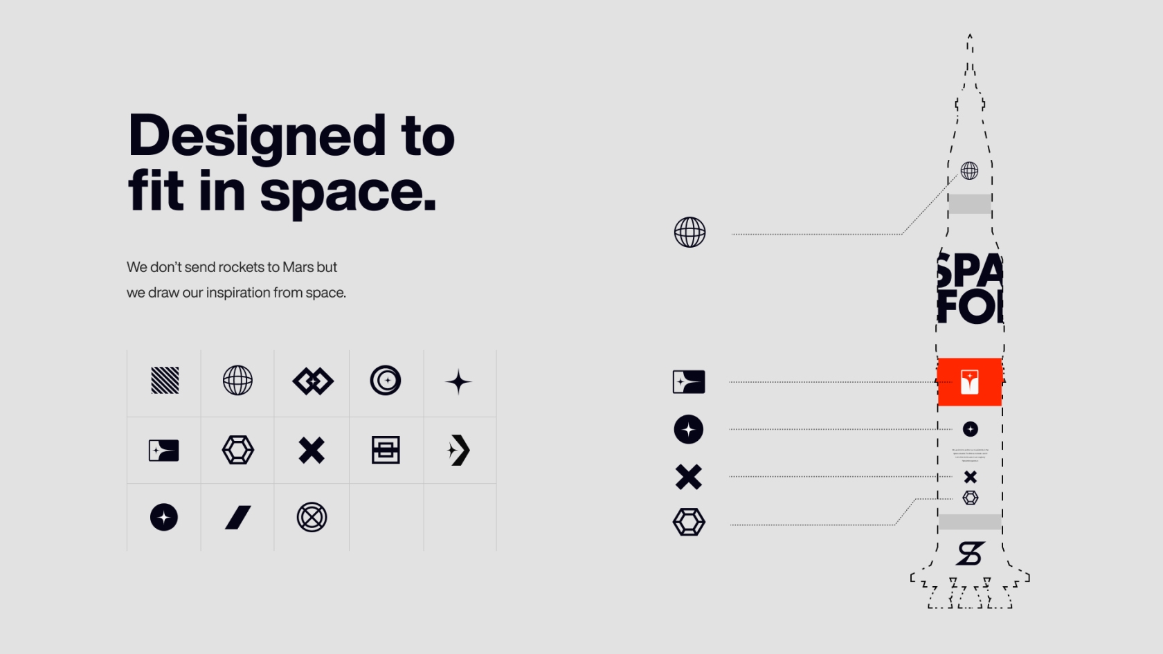
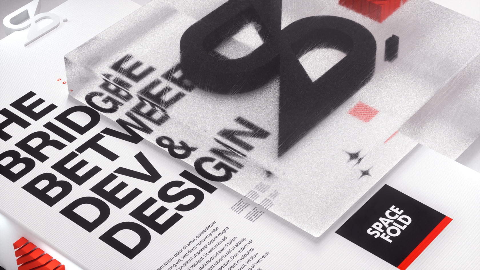
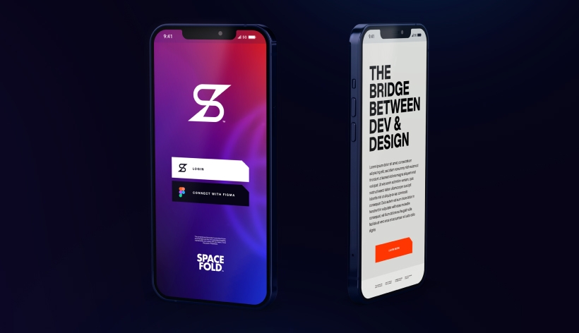
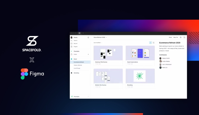
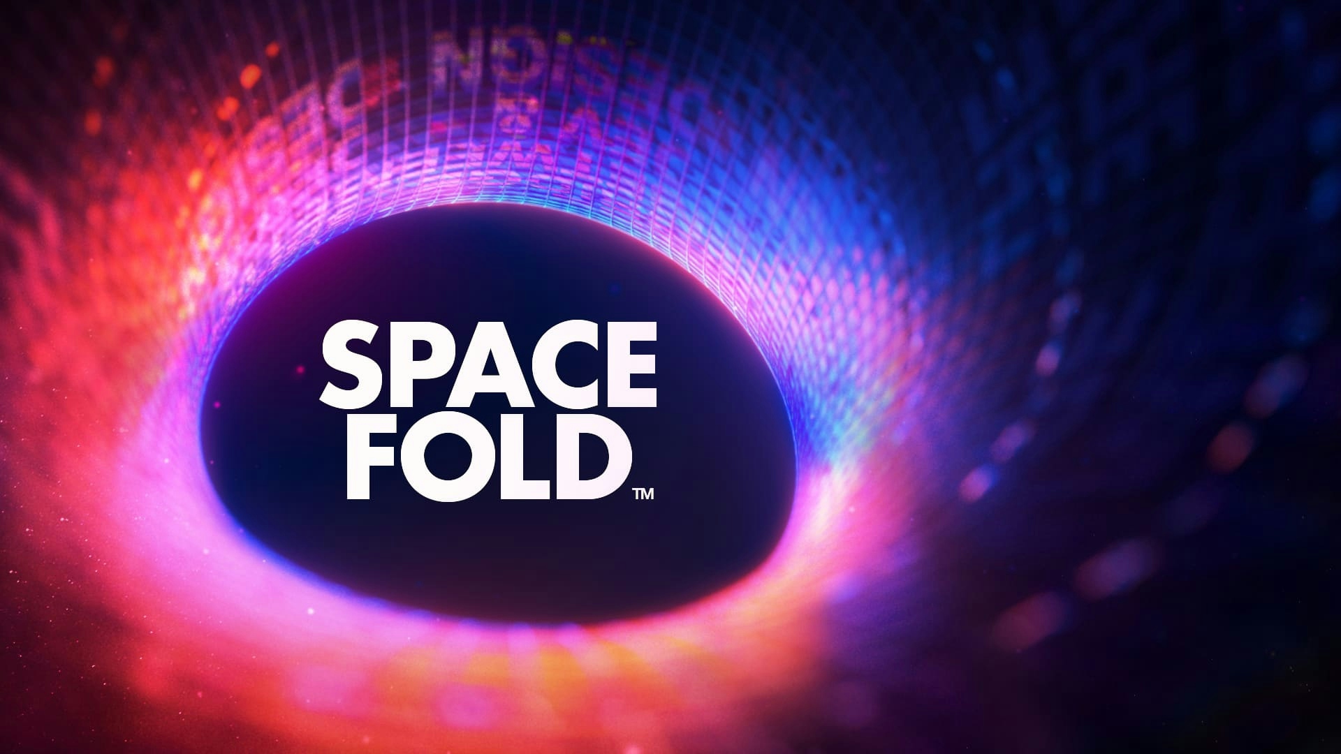
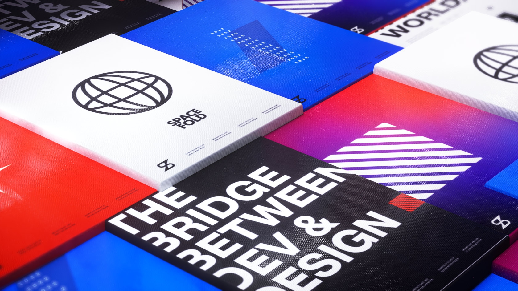
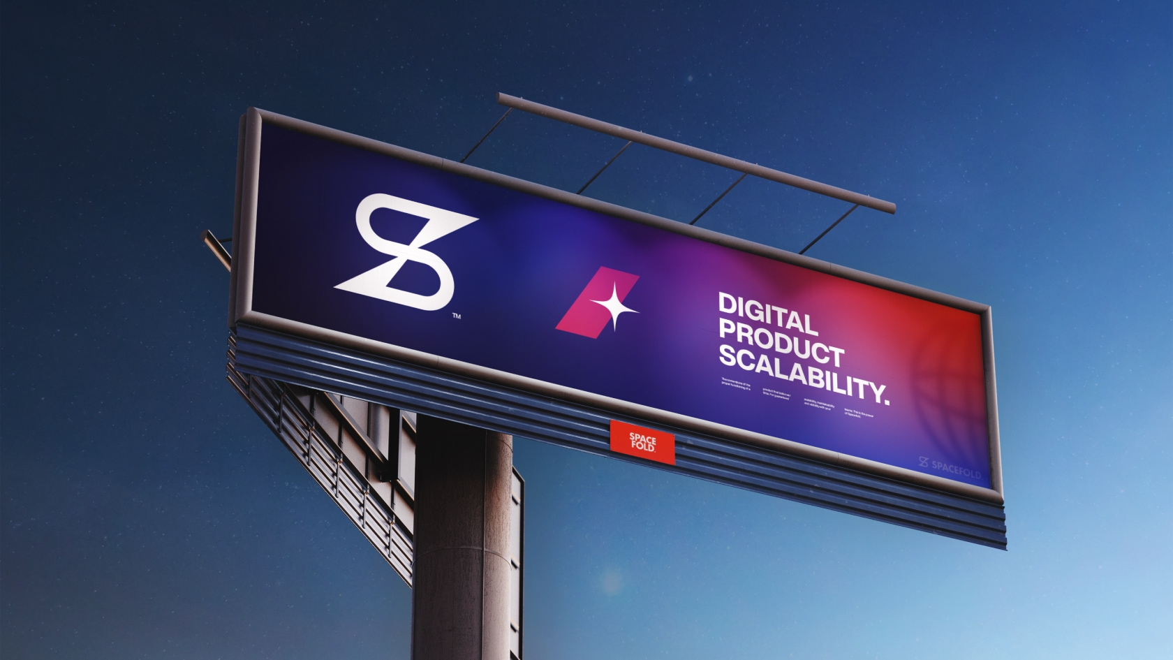
The visual identity of the brand.
Here we go. It's time to convert all the elements previously laid out into a graphic universe.
We explore all possible and imaginable directions and specify things as we go along.
The idea behind Spacefold is to reduce the gaps between all the elements composing a digital product that is worth the name.
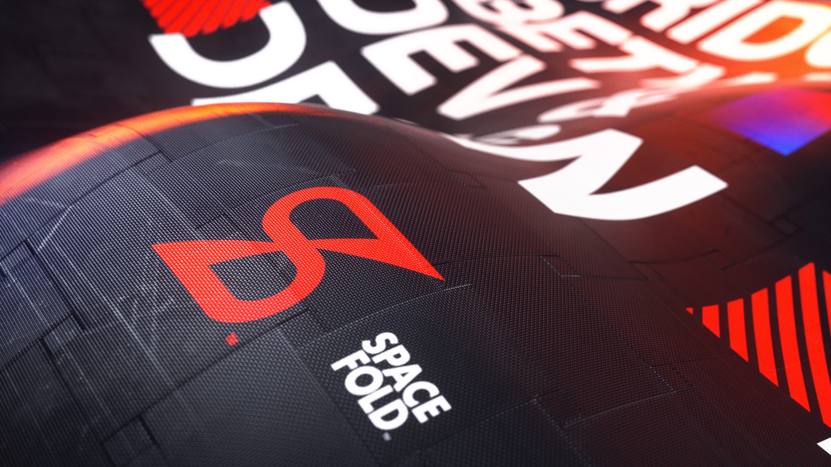
As the brand name suggests, we literally fold space back onto itself. This is our universe: space.
We design the trademark and the wordmark (in other words, the “logos”) of Spacefold. Then, we tackle the global identity.
Once we know where we're going, we set all the rules to allow us to play with it on the design and marketing side.
Once everything is fair and square and the universe accessible to all (even to people with disabilities), we formalize everything in our great graphic charter.
Here's what it looks like.